Scraping away at our visual paradigms
Diller Scofidio + Renfro Reimagining Lincoln Center and the High Line
by Tyler Dean

The Film | Facebook
We see it everywhere we go, whether in the wee hours of educational cultivation, the office windows of a cellular cubicle, or even the evening commute home on the train or bus: architecture. Each and every day we fail to notice the simple beauty of patterned intersections and the stop-and-go of businessmen and women. We fail to employ even a minute of our time to wonder how our own homes were constructed, how the layout being too large or small, the sides painted blue or green, might affect a passerby’s perception of us, of it, of themself. Is this phenomena of societal dissonance simply a willingness to remove ourselves from the strata of everyday life and call it “privacy”? Or is it something more. What we don’t realize is that in trying our damnedest to live in this bubble, we’ve inadvertently cut ourselves off from the very people that give us our identity, our proof of existence: one another. In Muffie Dunn and Tom Piper’s directorial debut Diller Scofidio + Renfro: Reimagining Lincoln Center and the High Line, this passive relationship with architecture and human interaction is explored, framed against a slew of entries focused on the trio’s theoretical-turned-practice methods of shaping voyeurism into glass, exhibitionism into travertine, and the murmurs of a pounding heart from wood.
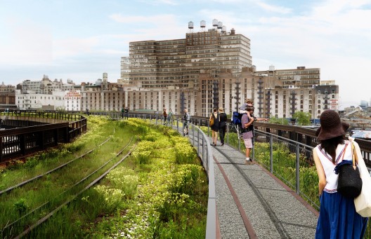
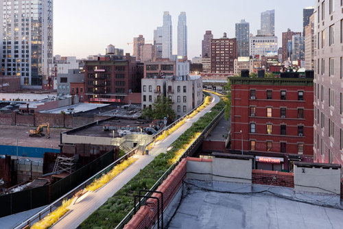
The film starts by introducing us to the New York City High Line. From 1847 until the late 1920s, the High Line was originally just a railroad whose tracks ran through Manhattan’s West Side at street level. However, due to the number of accidents which occurred on the street the railroad ran through, 10th Ave, the warranting of the nickname of “Death Avenue” ultimately led in 1929 to the New York Railroad calling for the High Line—elevation of the 13-mile track. Although this certainly halted the high number of casualties, people began using other modes of travel more and more until the High Line, now obsolete, was shut down in 1980, and the stretch of concrete and track, succumbing to opportunistic foliage and undergrowth, was virtually abandoned. Soon thereafter, a collection of property owners lobbied for its demolition, as it served no purpose other than taking up space.
However, not everyone felt this way, and the efforts in favor of demolition were defeated after the non-profit organization Friends of the High Line successfully advocated for its preservation. Thus would begin its transformation into a memorial of sorts. Enter Diller Scofidio + Renfro, a design firm that combines the integrity of architecture with the more redolent ambiguities of human nature and interaction. Wanting to preserve the historicity of the site, while at the same time acquiescing to demands that it be turned into a public forum, the firm came up with a layout that was agreeable on all sides: a masterful juxtaposition of concrete and nature, sections of the original railroad tracks would lay preserved in the twine-like tendrils of grass and stem (marked off by polite, unobtrusive stanchions and rope); strategically placed benches meant for those who wish to lie down and sunbathe; the original winding of the track’s structure allowing for walkers and joggers to enjoy a similarly urban experience.
For me, the theme of transparency riddled throughout Diller Scofidio + Renfro is most impressively conveyed in the designers’ use of the High Line’s sunken overlooks. Constructed in a manner whereby benches are positioned in terraced rows facing a large, framed sheet of glass, walkers can stop and enjoy the traffic and people going about their business below. The effect is obvious: a man or woman stopping to sit and watch from the overlook participates in a sort of public exhibitionism. We’re not talking about a one-way street either—for those doing the looking from above, all anyone would have to do from below is look up for a similarly voyeuristic show. It’s a successful endeavor on the part of Diller Scofidio + Renfro—one which people might not readily realize, but which nevertheless perforates the boundaries of the singular moments of our everyday lives.
Most striking about Diller Scofidio + Renfro is how Dunn and Piper manage to juggle themes so repressed in our own lives (e.g. themes of institutionalized privacy and unsolicited isolation) with subjective motifs on the very structures wherein we hide. The effect is immediate throughout, recalling a sort of Plato’s Cave as audiences watch the projected shadows of their own personal quandaries (for what is a theater room but a dark hubbub for anonymous equity?) onto a sheet of specialized screen fabric. For example, the idea of to-be-looked-at-ness mentioned earlier in conjunction with the sunken overlooks is taken to the next level when audiences realize that they themselves are witnessing these projections on a framed screened as well, a fact which I’m sure failed to escape the careful mise-en-scene of the filmmakers’ camera.
The other major point of the film is when Diller Scofidio + Renfro are contracted to update and redesign the Lincoln Center for the Performing Arts, “to bring it to the 21st century,” as Elizabeth Diller quips. When the center was reconstructed as part of an urban renewal project in the 50s, it was very cold and isolating. What was meant to bring the city together was actually pushing everyone further apart. Most poignantly exemplified by the courtyard directly in front of the Metropolitan Opera; a space productively utilized for a wide variety of shows and entertainment, would be all but abandoned come the rising sun. Approaching the project from the standpoint “what kind of space would I want to visit?”, the trio’s reconstruction of the High Line oozes with the openness and fluidity of interpersonal space so inherent in their previous works: sloping roofs-of-restaurants-turned-grassy-hillsides, glass-walled store- and building-fronts, terrace benched seating where those with tired feet could sit/lie down and enjoy the “show” (naturally, the view was that of a restaurant whose patrons’ interactions could be watched, and vice versa).
When it comes to a film such as Diller Scofidio + Renfro, it’s important to grip audiences from the get-go. I’ve related to several individuals since beginning my coverage of the Orange County Museum of Art’s Orange Film Series, that architecture and design aren’t exactly my cup of tea. Dunn and Piper prove that such an obstacle can be merely that; if you’re going to spend an hour-plus trying to describe the beauty of this or that, the best way to get your point across is to simply show you. With the help of experienced cinematographer David W. Leitner (having previously worked with Dunn and Piper on 2011’s James Salter: A Sport and a Pastime), the beauty of a disintegrated privacy and ubiquitous exhibitionism is eloquently conveyed in blue tones and grey hues, warm honey and pastoral greens. It is this stark juxtaposition against the more recognizable acres of concrete and steel that calls for a closer inspection of the city, as well as of the soul. Diller Scofidio + Renfro, finally, slows down the chaotic day-to-day of our lives, wherever we are, and asks us to try and fully appreciate the fact that architecture isn’t always meant to keep the world out, but to let it in.
“Diller Scofidio + Renfro has long been at the forefront of design. The interdisciplinary design firm, founded in 1979, first stirred interest with its provocative exhibitions of theoretically based projects that blurred the boundaries between art and architecture. With the almost simultaneous completion of two large-scale projects in New York City — the renovation of the High Line and revitalization and expansion of Lincoln Center for the Performing Arts — Diller Scofidio + Renfro has galvanized the public’s attention” [OCMA.net]
_______________________________
Follow ATOD Magazine™ and A Taste of Dawn™
The Orange County Museum of Art is located in Newport Beach, near Fashion Island, at 850 San Clemente Dr., Newport Beach, CA 92660. Hours for the museum are: MON-TUES, closed; WED-SUN, 11:00am-5:00pm; THUR, 11:00am-8:00pm.
Now in its ninth season celebrating the cinematic works and of emerging and established independent filmmakers, OCMA and the Newport Beach Film Festival present the 2013 Cinema Orange film series. Films will explore art, design and cultural icons. Interactive question and answer sessions with filmmakers will follow select screenings. Cinema Orange is organized by Leslie Feibleman, director of special programs and community cinema, Newport Beach Film Festival.


